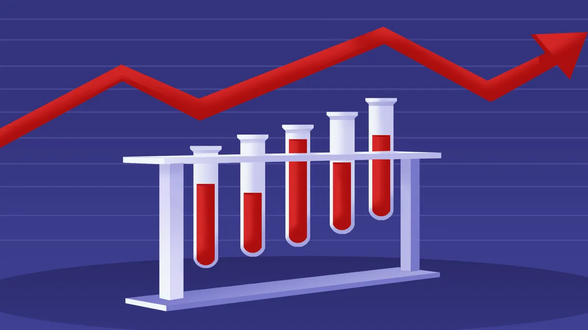
Dive Brief:
- The Safety Graphics Working Group has created a publicly available, web-based database of graphical designs for reporting clinical trial data. The goal is to make clinical trial data easier for viewers to understand.
- The group is comprised of a team from the FDA, the pharma industry, and academia.
- Funding and graphics expertise for the project was provided by Vanderbilt University.
Dive Insight:
There are many adages that denigrate the science of statistics. But despite the fact that statistics are confusing and subject to a certain amount of obfuscation, as Karl Pearson said, "Statistics is the grammar of science."
Biomedical researchers rely on statistics to convey critical information about everything from efficacy, to safety and tolerability outcomes, to which differences were statistically signifcant and much more. Unfortunately, statistics can be confusing and even to the trained eye, the proliferation of squiggles, dots, lines, and curves on graphs and bar charts can make statistical analysis more confusing, not less.
This means that many viewers never get beyond a superficial understanding of the data they're trying to understand—and in the process, they miss critical insights about adverse event outcomes, subgroup analysis and what those Q-T interval findings really mean.
Enter the Safety Graphics Working Group, which has created a step-by-step process for creating stastical graphics and plots by leveraging knowledge about how people naturally look for patterns in images. This group is using its deep reservoir of collective knowledge to use an artistic approach to making statistical graphs more easily understandable.
Now those who are creating graphics reflecting clinical trial data can make it easier for physicians and others to understand not only what the P value and confidence interval data mean, but also less obvious data—including data that could have a significant impact on their clinical decision-making.